Understanding MUI packages
An overview of the MUI packages and the relationships between them.
Tl;DR
Use
@mui/materialif you want to use the components following the Material Design guidelines.💡 You can import styling APIs (eg.
ThemeProvider,styled, etc.) directly from@mui/material.Use
@mui/baseif you want to style the components from scratch using your preferred styling method.💡 This package can be imported alongside
@mui/materialwithout an installation.Use
@mui/systemif you want APIs that enable building your own design system from scratch.
MUI packages
The following is an up-to-date list of @mui public packages.
@mui/material@mui/system@mui/base@mui/styled-engine@mui/styled-engine-sc@mui/styles
Why does MUI have multiple packages? Why not just one?
MUI started as a single package that provided React Material Design components. However, as the library grew and more people started to use it, we saw an opportunity to break the main package down into smaller parts. For example, there was rising interest in specific use cases, such as using a version of the components without styles so as to use a preferred styling method, or using the MUI styling API to build a design system.
For this reason, abstracting into smaller packages not only allows MUI to grow out of Material Design, but also extends how the library can be used, providing more flexibility and customizability.
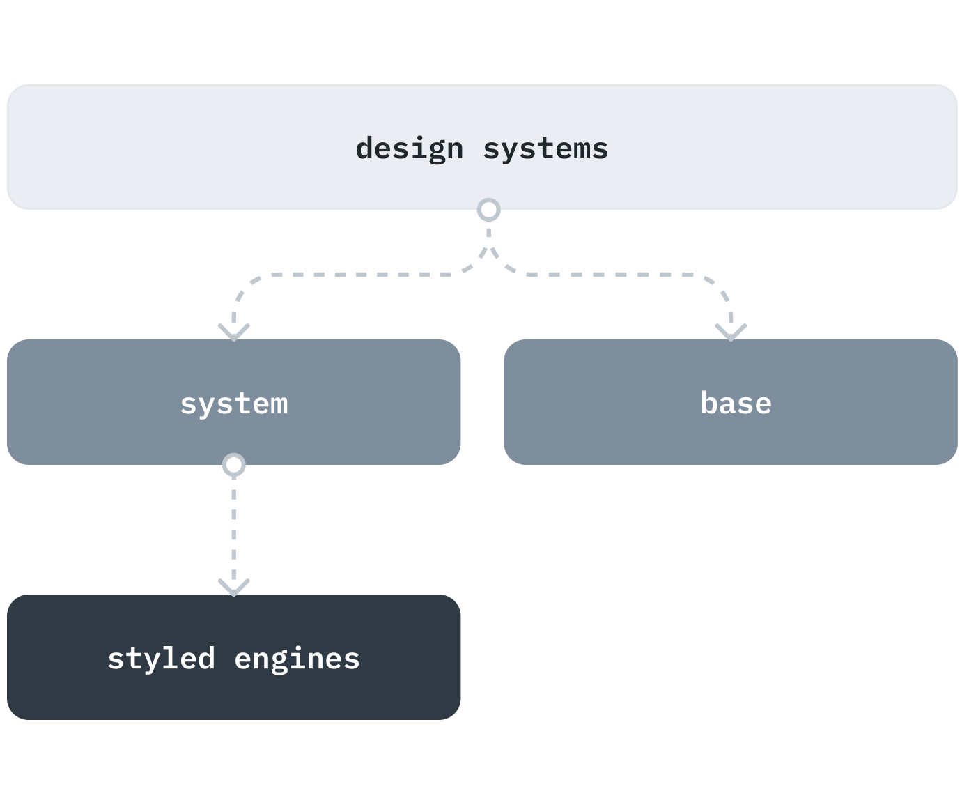
The packages can be categorized into 3 layers, as shown in the picture below:

Let's take a look at each layer to understand how they work together, starting from the bottom:
📖 Glossary
- install refers to running
yarn add $moduleornpm install $module.- import refers to making a module API available in your code by adding
import ... from '$module'.
Styled engines
This layer is specifically related to stylesheet generation (CSS-in-JS). MUI has introduced new styled-engines in v5 to unlock more possibilities and enable enhanced customization. Usually, developers do not need to interact with this layer on a daily basis because it is used internally in @mui/system.
They come in two packages:
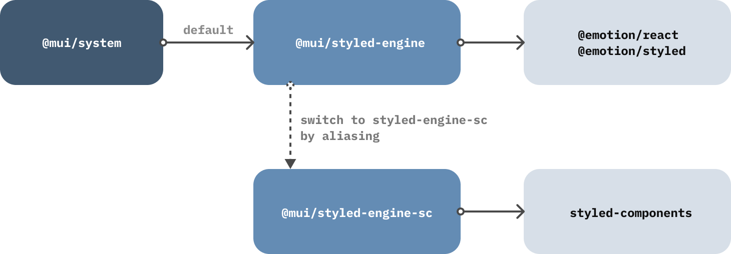
@mui/styled-engine: an emotion wrapper.@mui/styled-engine-sc: a styled-components wrapper.
These adapters unify the APIs of both emotion and styled-components, so that developers can choose to use whichever suits them best.
The previous style library @mui/styles (JSS wrapper) is deprecated and will be removed in the future.
The details about the change in styling solution are in this RFC.
System
There is only one package in this layer - @mui/system.
It uses the emotion adapter (@mui/styled-engine) as the default styled-engine to create APIs for building a design system from scratch. For example, styled from the styled-engine is enhanced to provide more theming capabilities.
If you want to switch the styled-engine to use styled-components, follow this guide.

Here are some benefits:
- You have full control of the
themeobject. - The
styledAPI supports thesxprop by default. - Components created with
styledare themeable via slots & variants.
Note: you will have to install either
emotionorstyled-components, because the respective styled-engine package depends on it.
Base
The base layer, @mui/base, is also known as unstyled components.
It provides only React component functionality and accessibility features without any styles. It's very useful if you want to take full control of the styling, but don't want to spend time building components from scratch.
Since it doesn't rely on any specific styling solution, you can pick a method that best fits your needs, from pure CSS to CSS-in-JS.
For more details, check out the unstyled components page
Design system
This is the most used layer (based on npm downloads) because it comes with everything you need to get started:
- Theming capabilities (has
@mui/systemas dependency). - Accessible components, and utility hooks (has
@mui/baseas dependency). - Default styles based on the design language being followed.
Currently, MUI has one package in the design system layer, @mui/material, but we plan to add more in the future. This package provides components that follow the Material Design guidelines and also re-exports necessary APIs from its dependencies. Since it has @mui/system and @mui/base as dependencies, you don't need to install or import them separately. Instead, you should import any modules you need from @mui/material directly.
There are, however, some cases where you might want to use building blocks from @mui/base instead. Let's imagine we're working on an application that mainly uses @mui/material with a custom theme and we've been given a Switch component design to develop that is very different from the one found in Material Design. In this case, instead of overriding the Switch from @mui/material we could use the styled API to customize the unstyled version of the Switch, available in @mui/base, from scratch:
import { styled } from '@mui/material/styles';
import SwitchUnstyled, { switchUnstyledClasses } from '@mui/base/SwitchUnstyled';

const Root = styled('span')(`
  position: relative;
  display: inline-block;
  width: 32px;
  height: 20px;

  & .${switchUnstyledClasses.track} {
    // ...css
  }

  & .${switchUnstyledClasses.thumb} {
    // ...css
  }
`);

export default function CustomSwitch() {
  const label = { componentsProps: { input: { 'aria-label': 'Demo switch' } } };

  return <SwitchUnstyled component={Root} {...label} />;
}